Back to Portfolio

Berea CS Slack Optimization

A UI/UX research project reimagining how students discover career opportunities within the Berea College Computer Science community

January 2026
UI/UX Research & Prototyping
Figma User Research Prototyping Usability Testing

The Challenge

Finding the right opportunities has become increasingly difficult, especially with the intense competition in today's job market.

At Berea College, students and alumni frequently share career-related opportunities with one another through the CS Berea Slack workspace. The jobs_internships_prof_dev channel serves as the primary hub for "internships, consulting, career exploration, part-time and full-time post-graduate opportunities."

The Core Problem

Currently, students lack the time to scroll through numerous posts in the Slack channel. Opportunities with deadlines frequently get buried as new messages appear, and posts automatically disappear after 90 days.

Students who aren't constantly checking Slack miss out on valuable chances simply due to poor visibility and limited filtering options.

Target Audience

Current computer science students at Berea College who use this channel to find opportunities such as internships, jobs, career events, and professional development resources.

Constraints

  • Working within Slack's existing design limitations
  • The temporary nature of message history (90-day limit)
  • Diverse needs of students seeking different types of opportunities

Competitive Analysis

I analyzed several platforms that help students discover opportunities to understand their strengths and limitations:

✓ Highlights
  • Filtering and sorting tools (LinkedIn, Handshake, Notion) make it easier to quickly find opportunities that match interests
  • Tagging and categorization (ColorStack, Notion, Trello) create structure and reduce noise
  • Personalized recommendations (LinkedIn, Handshake) help users stay aware of deadlines
  • Community-based communication (Slack) provides a trusted, student-centric environment
✗ Limitations
  • No system combines Slack's community feel with strong organizational tools
  • ColorStack opportunities page is exclusive to members
  • Notion/Trello offer great organization but aren't practical for this case
  • Handshake and job boards lack Slack's authenticity and focus only on traditional listings
  • Exclude opportunities like fellowships, scholarships, hackathons, grad school applications, research programs, etc.
Key Takeaway

These alternatives fail to capture the community-centered nature of Slack and lack the broad range of opportunities students need. There's an opportunity for a solution that combines persistent, searchable organization with Slack's community authenticity.

User Personas

To ensure the design meets real user needs, I developed two key personas representing different stakeholders

Junior CS Student

Primary Stakeholder

Goals
  • Secure a summer internship
  • Maintain visa status through opportunities
  • Find hackathons, fellowships, and conferences
Frustrations
  • Overwhelmed by the volume of posts
  • Checking Slack feels like a chore
  • Misses opportunities due to buried posts

Why Olivia? She represents the core users who struggle with volume, timing, and lack of organization within the Slack feed. As a busy student juggling coursework and internship searches, she often resorts to platforms like LinkedIn even though they don't account for her other interests like hackathons, fellowships, and conferences.

Faculty / Opportunity Sharer

Stakeholder

Goals
  • Effectively connect students with opportunities
  • Share opportunities from industry network
  • Support student success
Frustrations
  • Time constraints for posting
  • Unclear indicators of student interest
  • Difficulty organizing and prioritizing posts

Why Professor Montminy? She represents the faculty perspective - those who share opportunities and want students to succeed. Including her ensures the design serves both consumers and contributors of opportunities.

Participatory Design Research

Research Goal

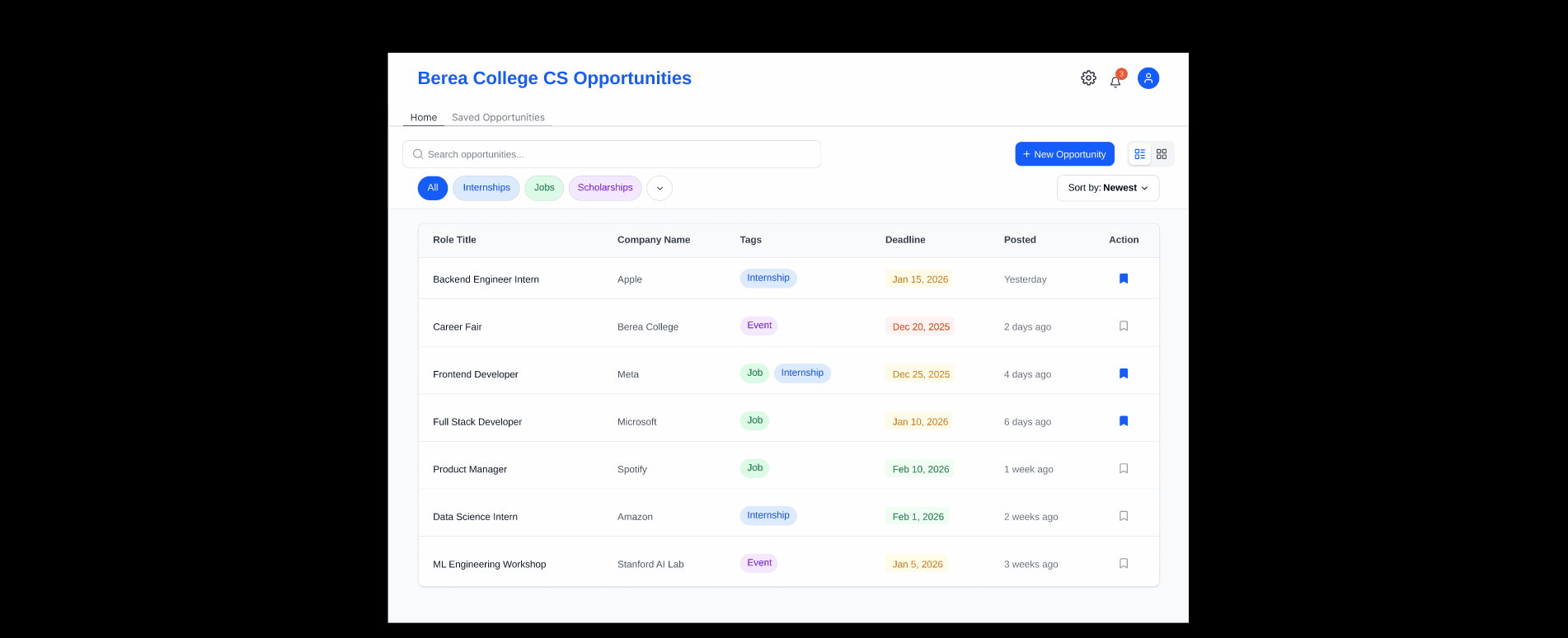
To pinpoint the best layout for displaying opportunities that's easy to read, find, filter, and interact with.

Key Research Questions

  • How much information should each post display so users can decide if they want to interact further?
  • How many posts should be shown at once before it becomes cluttered or overwhelming?

Method

I conducted Participatory Design sessions with a diverse group of stakeholders and end-users to discuss different platform layouts. In these focus groups, I presented various web app layouts and encouraged participants to share their thoughts about each one.

This method enabled me to identify what people prioritize, discover similarities between solutions, and record strong opinions on particular layouts and features.

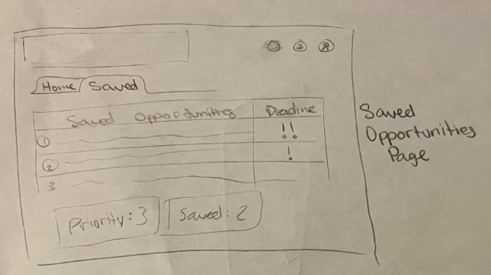
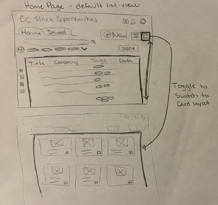
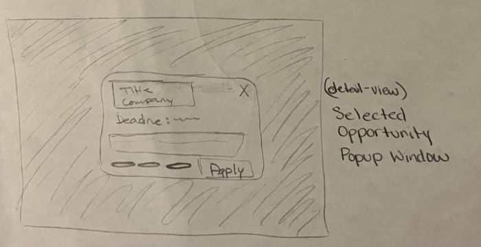
Layout Options Presented

I presented various web app layout options to participants to gather feedback:

Animated slideshow of various web app layouts used during research

Research Findings

1. Displaying Multiple Opportunities

Vertical Scroll ✗

Not well liked

  • Easy to lose your place
  • Feels exhausting
List View ✓

Most preferred

  • Quick and easy browse
  • Tags are very important
  • Include key deadlines in default display
  • Better for quick scanning
Card View ✓

Also well liked

  • Visually appealing
  • Cards shouldn't be too big
  • Too many cards can be overwhelming
  • Better for exploring

2. Detailed View of Selected Opportunity

Split Screen: Most disliked - not enough space to view content on either side
Popup Window: Very well received - allows users to keep their place without navigating to another page
Accordion View: Some liked the simplicity; others worried it could make the page feel too long

3. Data Management (Filtering/Tags/Sorting)

No strong preference between horizontal filter bar vs. vertical filter panel
Key agreement: Filters should be out of the way - consider collapsible or closable components
Critical Design Decision

Due to the strong division between List View and Card View preferences, I decided to offer both viewing options so users can choose the format that best suits their needs at the moment.

Prototyping & Development

Initial Sketches

After gathering feedback, I translated insights into low-fidelity sketches to explore layout, navigation, and information hierarchy.

Saved Opportunities Home Screen Detailed View Popup Window
Design Priorities
  • Minimize friction in filtering: Placed clickable tags immediately beneath the search bar
  • View flexibility: Added toggle in top-right corner to switch between list and card view
  • Deadline visibility: Made deadlines clearly visible for quick assessment
  • Popup windows: Implemented for detailed views to reduce navigation overload

High Priority User Flows

  1. Filter and save an opportunity: Home Page → Switch to Card View → Filter by "Internship" → Select item to open popup → Click "Save"
  2. Mark saved opportunity as completed: Home Page → Navigate to "Saved Opportunities" → Mark item as "Done"
  3. Post a new opportunity: Home Page → Click "Post Opportunity" → Fill out form → Submit

Digital Prototype

I recreated all initial sketches in Figma, refining the design and expanding different states. During this stage, I also added a new page specifically for users who want to post opportunities directly through the app.

Usability Testing

Cognitive Walkthrough

To validate design decisions and test the clarity of user flows, I conducted a cognitive walkthrough using the Figma prototype with a fellow CS student. I observed them completing the three core tasks with no guidance.

Results
Task 1: Filtering and Saving an Opportunity ✓

The participant immediately looked to the top-right corner to switch views - exactly where the toggle was placed. The task was completed smoothly, showing the structure felt familiar and intuitive.

Task 2: Marking Opportunity as Completed âš 

Completed without difficulty, but the participant asked what happens to completed opportunities - users may want to revisit them later.

Action Taken: Added a subtle gray "Completed" button below the navigation bar for easy access to previously completed opportunities.

Task 3: Posting a New Opportunity ✓

Completed successfully with no confusion.

Future Improvement: Add a post-management section where users can view or edit opportunities they've personally submitted.

Demo & Reflection

This project represents a comprehensive approach to solving a real problem within the Berea College CS community through human-centered design principles.

Interactive Demo

Below is a walkthrough of the final Figma prototype demonstrating the key user flows:

Animated walkthrough of Figma prototype showing user flows
Key Learnings
  • The value of collaborative sessions to help uncover user preferences and avoid making assumptions
  • How to balance competing user needs (e.g., list vs. card views) through flexible design
  • The importance of usability testing in validating design decisions